food-for-thought

Artists I Like- Vivian Maier

The Cincinnati Fotofocus Bienniel 2014 happened last month and I spent a considerable amount of time going to some of the exhibits that were up. Among the many that I liked, the show of Vivian Maier's work stood out for many reasons.vi finding-images-slide-OCW9-jumbo 
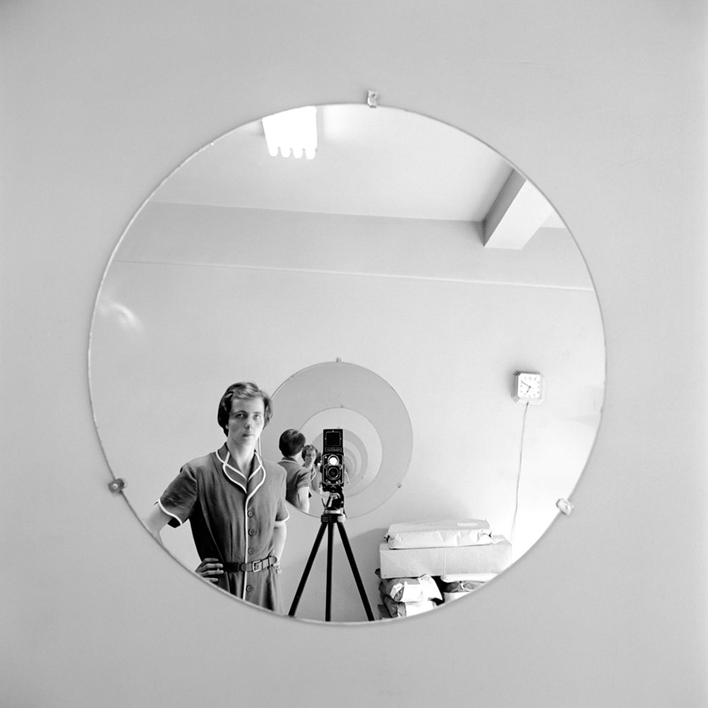
For those readers who are unfamiliar with her work, Maier was a nanny who worked primarily for families in Chicago. She was also a passionate photographer who would frequently go out into the streets with her Rolleiflex. She was a complete unknown until after she died in 2009, when her boxes of negatives were bought at auction and the images brought to the attention of others via exposure on the internet.


vivian_20Roberta Smith, in a NY Times review wrote that Maier's work "may add to the history of 20th-century street photography by summing it up with an almost encyclopedic thoroughness, veering close to just about every well-known photographer you can think of, including Weegee, Robert Frank and Richard Avedon, and then sliding off in another direction. Yet they maintain a distinctive element of calm, a clarity of composition and a gentleness characterized by a lack of sudden movement or extreme emotion."

Those sentiments sum up exactly what I was thinking when I saw this show. But I also couldn't help thinking how unique this exhibit was, in that the artist herself had no hand in it. The prints were not made by Maier, nor were they made under her supervision. The curator chose the images, the mats, and the frames, and specified in what order they would appear. It's rare that an exhibit happens under these kinds of circumstances, where the hand of the artist appears solely at the front end of the creative process.elle-vivian-maier-street-photography-8-de 
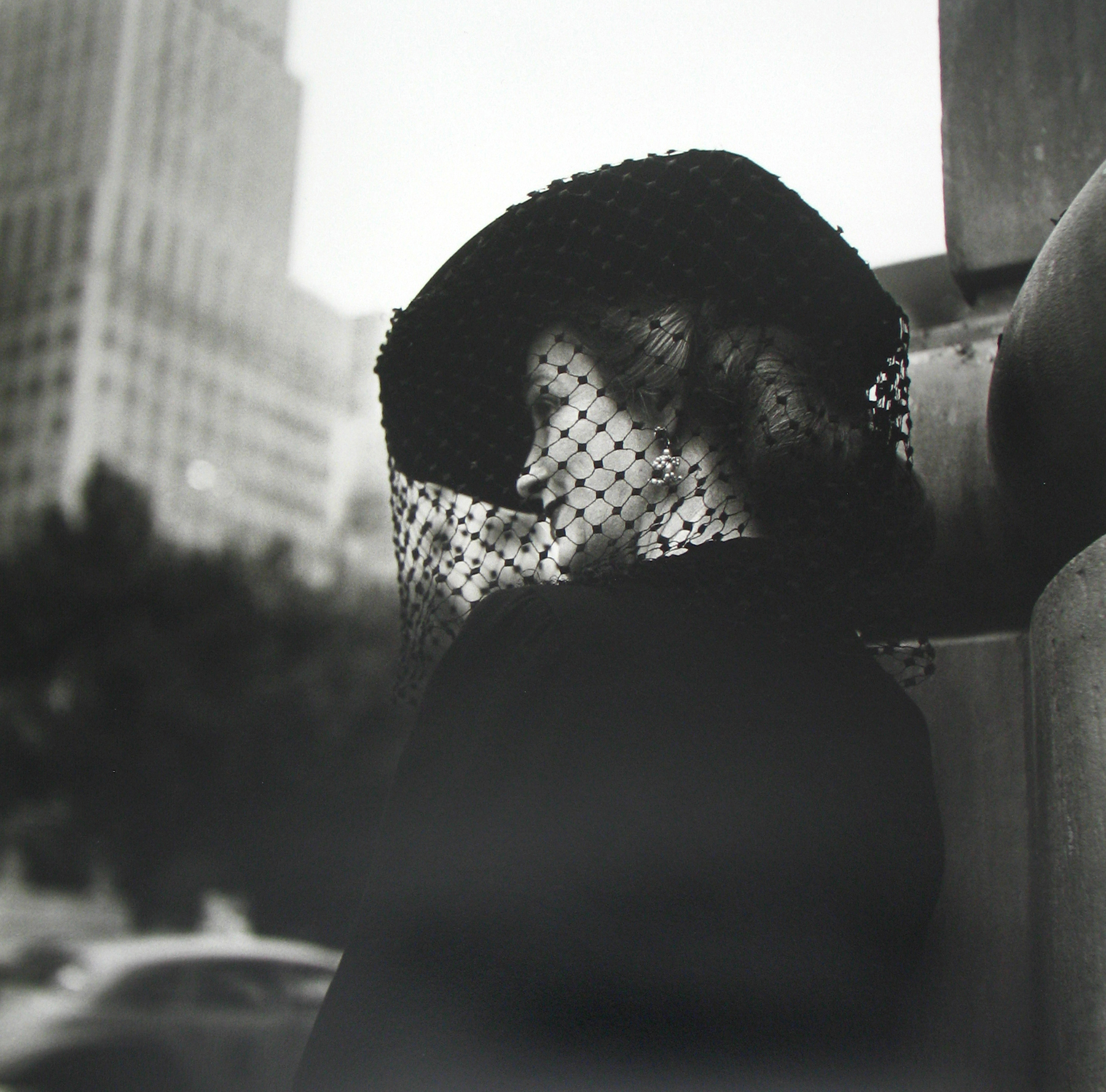
(As an aside, E. J. Bellocq's Storyville Portraits series and Eugene Atget's  photographs of turn-of-the-century Paris come to mind as other examples of this relatively rare phenomenon.)

In Maier's case, I couldn't help wondering if these images would have been those that the artist herself would have chosen to show us. What would she have picked instead? What themes would she have emphasized? As it was, the show was heavy on self-portraits and photographs of wealthy women in urban settings. It was fascinating to feel that Maier was not judging these women (ala Weegee), but rather observing them and presenting them to us for our own interpretation. I also vivian-maier-selfdidn't feel that she was comparing herself to them directly, although the juxtaposition of seeing her in the self-portraits with these other women led the viewer in that direction.

The exhibit was very powerful and moving, and I spent a lot of time there thinking once again about the role that editing plays in creating meaning in artwork.


Artists I Like- Diego Goldberg

Yet another entry in the "long-term project" list: The Arrow of Time project by Argentinian photographer Diego Goldberg. Every year on June 17, Goldberg and his family members make an individual head-and-shoulders portrait of him-or-herself and place them on a timeline. 1976. Diego and Susy.

Over the years, the timeline has expanded to include the addition of spouses, children and grandchildren as they were born.

1984. Diego, Susy, Nicolas, Matias, Sebastian.

One of the most interesting aspects of this project is that the pictures are presented vertically, thus allowing the viewer to look at the face of only one person at a time through the years. At the same time that the viewer's eyes take this in, one is still completely aware of the other faces on the periphery of one's vision. It's almost as if the others are lurking, daring you to see them.

2014. Diego, Susy, Nicolas, Matias, Sebastian.

Another aspect of this work that intrigues me is the singularity of the family members. They relate to each other only because each photograph in any given year is placed adjacent to the others, not because they coexist in the same physical space the way that Nicholas Nixon's "The Brown Sisters" do. Goldberg and his family members each stare out at the viewer, giving us no sense of their connection to each other.

This project is a great example of how the presentation of photographs can create meaning, and how repetition can do the same.


Artists I Like- Nicholas Nixon

My recent posts on Lucy Hilmer's work and on long-term projects are obvious clues to what is on my mind recently, photographically speaking. It therefore feels only fitting that I write today about "The Brown Sisters" project by Nicholas Nixon, for which Nixon has taken a photograph of his wife and her three sisters once a year for the past 40 years. 1975, New Canaan, Conn.

I have been aware of Nixon's entire body of work for a long time now, and have been intrigued by "The Brown Sisters" series, specifically, as it has unfolded over the years. The New York Times recently published an article about this series, which will be published in a book in November.

2014, Wellfleet, Mass.

Seeing Nixon's pictures in the Times article and reading the accompanying text make me consider exactly what it is that I am trying to do in my own long-term projects. More specifically, they bring up a question I ask myself frequently: "How are my own long-term projects different from those of other artists?"

Are they really different? If so, in what way? What distinguishes my work from any of the other long-term portrait or self-portrait projects that are out there? It's critical for me to answer these questions, and I'm glad that I have plenty of time to think about them as I work on gathering and editing the various projects that I've been working on over the years.

Do I have answers to these questions at this time? No. Will I ever answer them? Maybe. But forcing myself to at least address them is a healthy and necessary part of my creative process.

Unpublished Bodies of Work

My last post mentioned the work of Lucy Hilmer, whose website shows examples of three bodies of work she made that were shot over long periods of time. Seeing her work has made me think a lot about the fact that I also have three long-term projects going that have never seen the light of day. They are: 1. My "birthday" series. Every year on my birthday I put my camera on a tripod and shoot either one roll of 36-exposure film or 36 digital images that show what I do that day from the moment I get up in the morning to the moment I go to bed that night.

2. My "post-partum" series. This series actually began while I was pregnant, when I photographed a nude self-portrait once a month for the duration of the pregnancy. I wanted to track what my body looked like as the months progressed. After giving birth, I was fascinated by the changes the pregnancy had wrought to my body, and wondered how it would age over time. So every year on the anniversary of the birth, I take a nude full-length self-portrait in front of a white backdrop: one from the front, one from the right side, one from the back, and one from the left side.

3. My "sister-in-law" series. This series started the year before my sister-in-law got pregnant. I took a shot of her in front of her house one summer. The next summer, she was nine months pregnant and I thought it would be interesting to pose her in the same spot. The next year, I thought it would be fun to pose her with her and her toddler. And all of a sudden, a series was born. All three of her children are now grown and out of the house, but every summer I am back there, posing her in front of her house, and thinking of how much time and history have passed since I started.

I haven't exhibited any of those series- I am making them just because I want to make them- but enough time has gone by now that I going to start taking a more serious look at them, both as discreet bodies of work in and of themselves, but also in comparison to each other. It's another way to discover what I have been thinking and saying as an artist over long periods of time.

Artists I Like- Lucy Hilmer

It's great when friends send me links to the work of artists with whom I am not familiar. Lucy Hilmer is the latest artist that I have discovered through my friend Laurie.10 Hilmer has three series on her website, all of which address the issue of time and aging. The first series, "Birthday Suits", consists of pictures that she has taken of herself every year on her birthday since 1974. In them, she wears a pair of underpants, shoes and socks, but is otherwise nude.


The second series, "The Wedding House", shows Hilmer and her husband standing in front of the house in which they got married in 1984. They go there every year on their anniversary to make take a picture commemorating the event.

The third series, "My Valentine", is a series of 21 photographs, all of which chart the first twenty-one years of her daughter's life on Valentine's Day. The pictures depict her husband, who has on a black sweater, and her daughter, who wears white, and a rose.

Because I have shot a number of series in this manner over the course of many years, I have a real appreciation for the discipline required to get out your camera and take a shot every year on the same date. Hilmer's poses hint at what is going on in her life in any given year, without giving too much away, and I really respond to that. The fact that her work is in black & white makes it relatively timeless, as does the fact that her clothing in her "Birthday Suit" series is exactly the same from year to year. This work is for anyone who has ever been interested in the relationship between photography, time and memory.


Artists I Like- Dario Robleto

The best things often happen when you aren't looking for anything to happen at all. On a whim, I turned on the radio to an NPR station the other day, and almost instantly forgot my surroundings because I became so focused on the interview I was hearing. Dario Robleto, a conceptual artist who makes primarily sculptural pieces but does not limit himself by media, was talking with Krista Tippet for On Being, a radio show and blog based on examining the fundamental question: "What does it mean to be human, and how do we want to live?" What Robleto had to say about memory, art, depression, history, relationships, etc. spoke to me deeply. He values words as much as art objects and it's clear that he thinks a lot about the origins and execution of his work. What else can I say?! Listen to the podcast and prepare to be moved.

The Sun Remembers Your Shadow, 2012


Thoughts on the Aesthetic Experience

When writing up my last post about the importance of presentation in relation to the viewer's reaction to art, I was reminded of an interview that a former student of mine and fellow photographer, Kayla Wandsnider, conducted with me a few months ago. She was curious to know my thoughts on the nature of the aesthetic experience. I told her a story that once again speaks to the power of context and presentation in the experience of art: KW: I believe that environment can play a substantial role in an aesthetic experience. Do you think that this is true?

JAS: Yes, totally. An experience I had in Salzburg, Austria, comes immediately to mind. It was a very gloomy, rainy day and I was cold and wet and tired. While walking down a narrow street in the inner city on my way back to my hotel, I decided to go into a church I happened to be passing. The building was nothing special on the outside- in fact, it was so plain that I almost didn’t recognize it as a church. I went in because I simply wanted to sit down and rest for a while.  At the exact moment that I entered, the opening chords of Bach’s Toccata and Fugue in D Minor rang out unexpectedly, filling the church with glorious sound that seemed to cascade torrentially out of the heavens. At the same time, light poured down through the church's long, slender windows, in stark contrast to the overcast gloom outside. I was completely paralyzed with shock. I hadn’t expected it to be so light inside, hadn’t known that music of any kind would be playing, hadn’t anticipated that I would suddenly be experiencing something so moving, so beautiful, so arresting. I could hardly breathe, it was so overwhelming.

I sank slowly into a pew as the music continued to play, not really seeing anything, living completely in the moment. It felt like time was suspended.

The combination of the location, the weather, the light, the music, my physical state and, yes, the unexpectedness of it all, led to one of the most profound aesthetic experiences of my life. And it wasn’t about the church building, it wasn’t about the music itself, it was an experience that came about because ALL of those things put together transported me to…. Somewhere Else. I will never forget it.

Click here to read the entire interview.

The Importance of Presentation

There was a great article in the New York Times a couple of days ago that ruminated on the nature of museum artifacts and the power they have to emotionally move viewers, as well as to intellectually stimulate them. There are a number of shows currently up in NYC that succeed at these tasks more or less successfully. Part of the article discussed that the manner in which these artifacts are presented to the public makes a huge difference in how the public perceives and experiences them. If one can view the artifact in close physical proximity, "The artifact becomes a spur to the imagination: It reveals history as something lived, and thus as a result of choices made. We come more alert to the ways things are, and how different they might yet be..."

But, it goes on to say:

"If an exhibition is staged so we are placed too close to another world without being given tools to make sense of it, the effect is disorienting rather than clarifying. The artifacts can amaze, but we can't use our imagination to go further."

Exactly! The full article can be found here.

"The Paradox of Art as Work"

In a NY Times article published on May 11 titled "The Paradox of Art as Work", writer and critic A. O. Scott examines the relationship between art and money. One part of the article in particular stood out to me and is quoted here: "In the popular imagination, artists tend to exist either at the pinnacle of fame and luxury or in the depths of penury and obscurity- rarely in the middle, where most of the rest of us toil and dream. They are subject to admiration, envy, resentment and contempt, but it is odd how seldom their efforts are understood as work. Yes, it's taken for granted that creating is hard, but also that it's somehow fundamentally unserious. Schoolchildren may be encouraged (at least rhetorically) to pursue their passions and cultinvate their talents, but as they grow up, they are warned away from artistic careers. This attitude, always an annoyance, is becoming a danger to the health of creativity itself."

He goes on to make other excellent points that I won't go into here. But I myself have experienced time and again that attitude he describes about art being seen as "unserious", and it annoys me just as much today as it did decades ago when I first experienced it. If the work artists do is "unserious", then I'd like to be able to wave a magic wand and eliminate any and all things visual, aural, written, etc. that have been created by artists throughout the centuries and see what would be left. How many buildings would be missing? How many sounds? What would the world actually look and sound like without the works of artists?

Then let's talk about artists being "unserious"!!!

Artists I Like- Michael Somoroff

Artists often take on the challenge of trying to convey the absence of something. I am no different in this respect, for my work frequently wrestles with the notion of memory, which is inherently fleeting and notoriously changeable as time passes. My Tears of Stone project set out to convey the enormity of loss in the massive number of casualties in World War 1, without actually showing people grieving. So I was instantly intrigued by Michael Somoroff's work "Absence of Subject". Somoroff carefully chose certain images by German photographer August Sander to work with and created a body of work that is visually arresting and thought-provoking. Microsoft Word - deltio typou Somoroff_Sander_EN.docSander was most famous for his body of work titled "People of the 20th Century", a collective portrait of the German people from all walks of life taken during the Weimar Republic.

timthumbIn each of Sanders' images (seen in these images on the left), Somoroff has digitally erased the human subject(s) originally found in them, leaving only the background and surroundings for the viewer to contemplate.

Because these photographs are shown together, the viewer immediately compares the two and is asked to engage with the issue of "subject".

artisti-di-circo


How important is the human subject to our reading of this photograph? What happens to the meaning of the photograph when that subject is erased? What is lost or gained through this manipulation? Is familiarity with Sanders' work important to understanding Somoroff's? Does the fact that Sanders' photographs were taken in the 1910's-30's inform our reading of this very contemporary treatment of them? I love it when artwork provokes questions like these!

august-sander-e-michael-somoroff-absence-of-subject_2887_header

Artists I Like- David Maisel

A few years ago, David Maisel created a body of work titled "History's Shadow".HS_AB8A8B_MAISELHere is what he says about it: "History’s Shadow has as its source material x-rays of art objects that date from antiquity through just prior to the invention of photography. The x-rays have been culled from museum conservation archives, re-photographed and re-worked. Through the x-ray process, the artworks of origin become de-contextualized, yet acutely alive and renewed. The series concerns the dual processes and intertwined themes of memory and excavation."

I find this body of work thought-provoking partly because of its simplicity. By specifically choosing to use x-rays of objects that pre-date the invention of photography, Maisel asks us to consider aspects of these objects that it was impossible to "know" without the photographic medium. HS_GM16_MAISELThe x-rays animate these objects in a weirdly magical way. As a viewer, I think about the vision and intent of the humans who created the objects in the first place, as well as wonder what the makers of the x-rays hoped to discover so many years later. It's a wonderful approach to memory and history- two of my favorite subjects.

Thoughts on Joan Fontcuberta

I recently attended the Society for Photographic Education's national conference in Baltimore. Joan Fontcuberta was a keynote speaker (articulate, funny, thoughtful- every keynote speaker should be so engaging!) and he said many things that really struck me. He was talking at one point about photographic truth, a topic with which he has been intensively engaged throughout his career. (Go to his website and you'll see what I mean.) He said, "In today's world, photography is Google." He went on to explain that, back when photography was born in the 19th century, everyone looked at it as the ultimate arbiter of Truth. If it was photographed, then what was seen in the photograph must be true. It did not take long for photographers to challenge this notion. And today, people treat the internet the same way. We search for information on Google and tend to believe that whatever results we find are true, even though we know that isn't so.

I found his notion really interesting, and had something to chew on for the rest of the conference.

Artists I Like- Deborah Parkin

A friend of mine recently clued me in on the work of Deborah Parkin. She writes a lovely blog, in which she shares many thoughts about how her life intersects with her photography. siblings300  

She's unfailingly honest about the conflict she feels about the time spent on photography vs. the time spent with her young children. This is something all artist/parents wrestle with, I think.


I particularly like the mood in her photographs- they are very evocative. chimneys+high+res+bromoil+positive

Artists I Like- Jackie Nickerson

Jackie Nickerson has recently published a book titled "Terrain". In it, she depicts laborers on South and East African farms. f97def313f9aea1db917ccb532734ee5-large Rather than being straightforward depictions of these people at work, she shows them with the materials of their labor obstructing, at minimum, their faces, and sometimes most of their bodies.


35b38f46c2402c47df7baf0233128f86-largeThis has the effect of transforming both how we view the workers, as well as the work they do.

These photographs are great examples of how straightforward photographs can be invested with many layers of meaning.

"The Gap"

Ira Glass, producer and host of the radio show "This American Life", put together a short video about "The Gap", which any creative person experiences at one point or another. The Gap happens after you've had an idea and a project has been started, but you are now in the middle of it and don't quite know where you are going and how it's going to turn out in the end. This is the point at which you get frustrated and begin to lose faith in what you are doing. Thoughts of quitting arise. Doubt gnaws at your brain. Here's a link to the video.

Right now, I am in The Gap with my current project. And the only way to deal with it, as Glass says, is to just keep going. Keep making work. Keep shooting, processing, printing, questioning. Just keep moving forward.

In past experiences with The Gap, I've discovered that it may last a short time, but it also can last for quite a long time. Regardless of how long it lasts for any given project, one has to have faith that it will all work out and that the end result will be satisfying. And if it isn't, well, then isn't that something we can learn and move on from as a starting point for what we do next?


Creativity & Being Uncomfortable

My most recent posts have touched on some of the technical issues that I've been having with my current project. The question of what camera to use has loomed large, and has gotten me thinking a lot about comfort zones. The questions I have wrestled with are: "Am I too comfortable using the panoramic and/or square format? Would I challenge myself more by using a different format camera?" The answer I have come up with, at least for now, is, "No" to both questions. One of things I love about using the panoramic or square format is that I constantly feel challenged to further explore their possibilities. Rather than feeling predictable, they force me to rethink what I am doing every time I use them. I have never felt that way using 35mm, 6x7 or 4x5 cameras.

But the larger question here is: "Will my work improve if I force myself to work in a way that makes me feel uncomfortable?" My answer to this is: "Yes." I also believe, however, that if I am uncomfortable with everything I am doing, my brain grinds to a halt. What works best for me is to make myself uncomfortable in limited-but-ever-changing ways throughout the course of a project. I've found that throwing only one or two wrenches into the works at any given time does an amazing job at putting me off my stride and forcing me to reconsider what I am doing.

Being uncomfortable is part of the sometimes-painful process of bringing new work to life, because it leads to uncertainty. But I've found that I ultimately grow more creatively when I force uncomfortableness upon myself and that makes that it totally worthwhile. Here's a great article that speaks to this: "The Creative Benefits of Exploring the Uncomfortable".

Making the Familiar Strange

In my last post, I quoted a sentence that was in reference to Seamus Heaney's poems: "He takes the familiar and makes it strange." This sentence describes perfectly what I am trying to do in my current work. Because this is no easy thing, I have been thinking a lot about what it is, exactly, that can make the familiar into something strange or unsettling. In researching this, I came upon this blog entry by Pat Thompson, Professor of Education at the University of Nottingham in the United Kingdom. She writes about how de-familiarization is about "seeing things differently, and understanding them differently." The ability to convey to viewers/readers/listeners this different understanding of something familiar is key.

Musicians are challenged by this concept any time they do a cover version of a well-known song. Sometimes they produce a more-or-less faithful rendering of the original, but other times, the cover version causes the listener to hear something in the song that had been previously unknown. I can think of two examples that illustrate this perfectly.

The first is Whitney Houston's "How Will I Know". Her original was a perfect piece of pop confection that speaks to the angst of young women just starting on their journey of negotiating relationships. Her a cappella version, although not a cover version by someone else, reveals the concerns of a grown woman who has already lived a life and experienced failures in love.

The second example is Chris Cornell's cover of Michael Jackson's "Billie Jean". There is a gritty, desperate aspect to Cornell's version that was absent for me in the original. I had become complacent about the song until I heard Cornell's version, which caused me to relisten to Jackson's original and rethink what i thought I knew about it. I found far more angst and anger there than I had heard initially.

In both cases, the experience as listener was revelatory, exciting and..... strange. You are familiar with the subject, but because it is being presented to you in a way that is different from the norm, you feel like you don't know it at all. It is this sensation that I am aiming for in the photographs I am creating right now.

Describing Your Work to Others

Although I believe I am a fairly articulate person, I always seem to stumble when someone asks me what my work is "about", or what kind of artist I am. I inevitably end up using far too many words to answer those questions. In the January/February 2014 issue of Intelligent Life magazine  (which is published by the Economist) author Christina Patterson describes how Nobel-prizewinning poet Seamus Heaney used words to create maximum impact. There was a sentence in that article that is the perfect description of what I attempt to do with my work:

"He takes the familiar and makes it strange."

That sums it up perfectly, particularly in regard to the project that I am currently working on. Here's an example of my most recent work-in-progress that I feel effectively does that:DSC_2557 V3Now I just have to drill that sentence into my head: "I take the familiar and make it strange." and use it whenever I'm asked what kind of work I do. If only I could do that to the degree that Seamus Heaney could!

Artists I Like- Ben Alper

Art Photo Index (API) recently published its inaugural show in a new online exhibition series it's launching. Titled "Fear & Loathing", it was curated by Katherine Ware, Curator of Photography at the New Mexico Museum of Art. In it, I've discovered the work of Ben Alper.

Although his website doesn't provide any artist's statement that I could find, his interests revolve around the role that photographs play in the recording and archiving of memory. I found this picture particularly compelling:

"Erasure #15", by Ben Alper

Many of us have seen something like this in the course of our lives- a page in an old family album that is missing its pictures, with a few informational notations scattered on it. But there is something both poignant and awful about what this photograph suggests - the loss of memory, the loss of the family unit, the loss of family members, the loss of identity, the inevitable and relentless passage of time.

"Athazagoraphobia" is the term for the fear of forgetting or being forgotten about, and Alper's work speaks to that idea quite powerfully.

Same Object - Different Uses

If you give each of 5 different artists the exact same object to use in her/his work, you are guaranteed to get 5 different results. I've always been interested in this idea. Take for example, band-aids. I recently saw this picture by Eric Klemm, which used a lot of band-aids: "Laura"


What I see in this picture is vulnerability, sadness, a fierce barrier that has been put up between the world and this child. The fact that the application of the band-aids was so deliberate and purposeful makes it the antithesis of playful. They work as a defense against some unseen threat, and imply impending injury of some kind to me.


Compare the use of the band-aids in that photo to one that I took, which is from the "Shadowing the Gene Pool" series:

"Muscle Girl"

In this picture, the band-aids serve quite a different purpose. Rather than being a barrier, they are used almost like tattoos, markers of power and strength. The body English of the little girl adds to that effect. They say, "Yes, I am vulnerable, but that's irrelevant."

I'm sure if I searched the Web for "children with band-aids" I would find countless pictures which would use the band-aids to express different things. That's why no photographer should ever shy away from photographing anything. It's not WHAT you photograph, it's HOW you photograph it that will make it fresh and exciting- or not.